
Brand assets
Logos, colours and type for anyone writing about us or working with us. Use the files as they are; please don't redraw, recolour or stretch them.
Logos
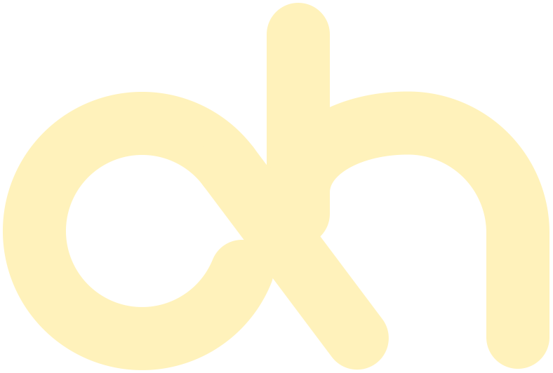
The wordmark is our main logo. Use the monogram when space is tight, such as app icons, avatars and favicons. Give every logo clear space at least the height of the monogram's loop.






Colour
Teal carries the brand: text, buttons and the logo. Sky and butter are for backgrounds and large shapes, never for text. Select a colour to copy its hex value.
Typography
DM Sans for everything, free from Google Fonts. Headlines are bold and tightly spaced; body text is regular at a comfortable size.
0123456789
Strategy and voice
Better software starts with the people using it. We write the way we design: plainly, for the person on the other side.
Plain over clever
Say what it does. "See who's waiting", not "unlock queue intelligence".
Name the action
Buttons say what will happen: "Book cleaning", not "Submit".
Calm and specific
Errors explain the fix: "Add your email and send again." No apologies, no blame.
Better software starts with the people using it.
Make the everyday easier.
Our circles come from the brand's shapes: big, soft and partly off the edge.